
I’ll admit that I love a good dashboard. As an aid to SaaS operators seeking to optimize business performance, dashboards can be invaluable.[1] Stephen Few defined a dashboard as, “a visual display of the most important information needed to achieve one or more objectives; consolidated and arranged on a single screen so the information can be monitored at a glance.” This is a useful definition that makes clear: dashboards are instruments of control. Specifically, just as dashboards within vehicles aid in the controlled navigation of those machines, company dashboards help leaders drive organizations forward while controlling speed, direction, and business health. And yet…the irony of dashboards is that before advancing any aspects of a business, sacrifices must first be made in the very same areas that leaders seek to optimize. To go fast, you must first go slow. To go far, start with steps backward. To increase control, make a conscious decision to loosen oversight.
With these contradictions in mind, this post strives to flash a warning light (see what I did there?) by dispelling any illusions leaders may have about scoring easy wins with dashboards. Rather, it introduces some questions to ponder and detours to explore when considering dashboard initiatives. Hopefully these will help folks achieve the goal of getting past the entry-ramps and using dashboards to confidently drive the business forward in the fast lane.
Control: This is What Democracy Looks Like? Advocates of dashboards sometimes tout them as nobly delivering democratization of data. But do dashboards inherently reinforce the notion of one person, one vote? Not necessarily (the term “executive dashboard” seems to succinctly refute this point). Rather, a key question to be answered early in a dashboarding effort centers around data roles, rights, and privileges. Who gets access to what data? Is the dashboard’s audience the CEO? The Leadership Team? Every team member within a business (including / excluding contractors and consultants)? Should there be a curated / filtered set of data for each? Oh, and, what about the board of directors?
A related question centers on how dashboard information is consumed — on a push or pull basis? Purists might argue that dashboard users should be able to “pull” information. That is, they should be able to access what they want, when they want it, and manipulate the information to suit their needs. The problem, of course, is that this is horribly inefficient and variable — we humans rarely know what we want until someone presents it to us as a solution to our needs. That view supports the position of what I call “curators” who believe dashboards are best served up on a push basis. In an extreme version of this model, some analyst-type packages up KPI’s into a report and shares it with a defined set of stakeholders on an agreed-upon cadence. This approach is certainly efficient / prescriptive, but not at all a beacon of data democracy.
My own experience here is that the middle is marvelous. Dashboard information is most valuable when shared broadly with a large number of stakeholders and with minimal access constraints. But the dashboard should also be structured and streamlined, not just a filtered database that can be used to spin-up infinite ad-hoc reports (after all: if everything is important, then nothing is). Finally, regularly scheduled all-hands reviews of the dashboard by company leaders are key to offering commentary and context. This helps provide all stakeholders with a clear understanding of “what matters, how we’re doing in those areas, and what each of us can do about it.” In this way, leaders can absolutely gain more control over their business through dashboards. But they must first be prepared to loosen the reigns on potentially sensitive data and to make themselves vulnerable by sharing it (in good times and bad). I’d argue this approach doesn’t represent a pure (data) democracy, but perhaps it is more like a high-functioning (information) republic.
Speed: Slow is Smooth, and Smooth is Fast: This useful adage from the Navy SEALs has been widely analyzed (e.g. here, here, and here). The general gist is that “the best way to move fast in a professional setting is to take your time, slow down, and do the job right.” This is particularly prescient in connection to implementing business dashboards. As leaders, we want dashboards to serve as an accelerant: to provide early alerts about deviations versus plan, to streamline our decision-making, and to speed the pace of collective results. But…to go fast, we need to start slow. A big-bang approach simply doesn’t work when creating dashboards. Never have I seen a version 1.0 dashboard that was worth a darn. In fact, “if you move too quickly, you bump and bounce and veer from that path because you are frantic, trying to do too many things at once.” Rather, a deliberate and iterative approach to creating dashboards allows leaders to test, learn, adapt, and develop a dashboard that truly serves the needs of the business — over time.
A corollary to leaders’ “need for speed,” is the desire to automate the updating of dashboards. Like a scene from Minority Report, the dashboards in our imaginations should miraculously and effortlessly pipe future-illuminating intelligence directly to our brains on a continuous loop. It’s a compelling vision; and automated updates to dashboards are totally doable — eventually. But a fair degree of manual work is necessary to get a dashboard stood-up. Manual data-entry (the antithesis of tech-enabled efficiency) is often required at the outset of a project, particularly in the early iterations described above. Even after graduating from data-entry, labor is needed to enable efficient and error-free data feeds from different company systems. It. Just. Takes. Time.
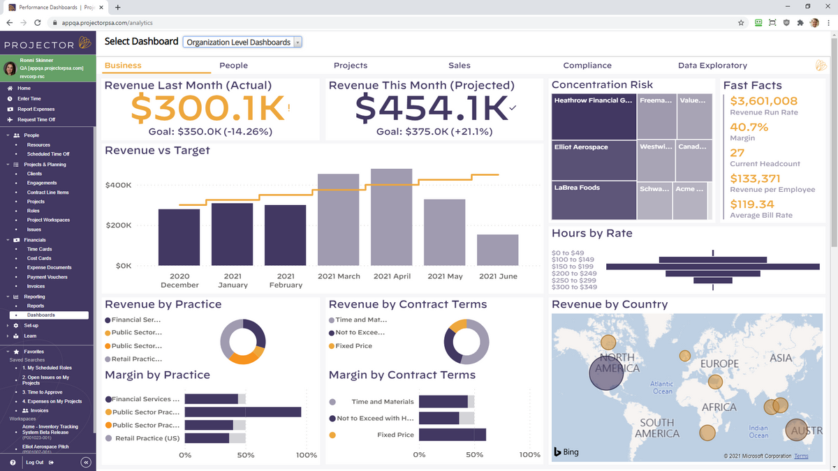
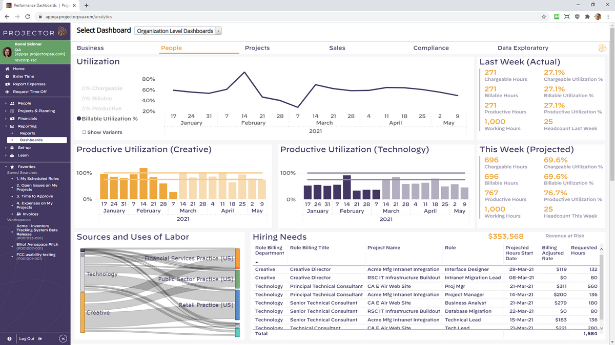
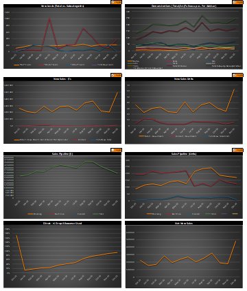
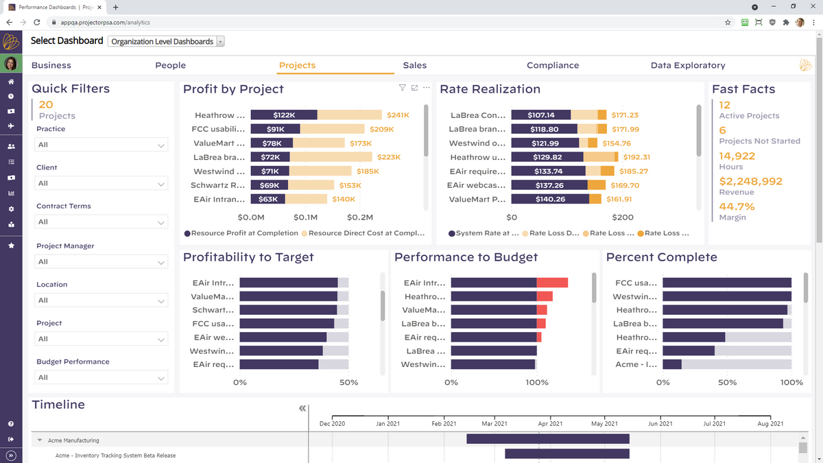
In my view, balance is helpful in navigating the tension between slow and fast. Having botched overly ambitious dashboard initiatives, I’ve learned to start small and slow. It’s wise to avoid throwing out an otherwise valuable metric, simply because it is hard to collect — report what matters to the business, even if it requires manual data entry. Conversely, don’t prioritize the automation of data collection early in a dashboarding effort. Doing so can mean “letting the great be the enemy of the good;” and technical glitches have killed countless promising projects. One of my all-time favorite dashboards (a snippet of which is included below) took 18 months to get right. Initial versions were brutally tedious to update — manually. And even in its prime, it was never visually impressive. But, by taking our time, we eventually created an astonishingly valuable tool that helped accelerate the business.
Horizon: Is Real-Time Really the Best-Time? Another common hope among leaders is for dashboards to help predict the future. This translates into wanting to (a) report the most up-to-date information and (b) measure that information in shorter and shorter chunks of time — by month, week, day, hour, and even by the minute. This works well for many metrics, where recency really matters. For SaaS businesses, such metrics might include website visitors, numbers of qualified leads, product usage metrics, or volumes of support tickets.
But other metrics evolve on a slower cadence; and measuring them over short time horizons is less helpful. As a correlate, I’m reminded of the recommended method for taking one’s pulse: top medical organizations advise counting someone’s pulse over a 60 second span. Although it would be a lot more efficient to measure someone’s pulse for only 2 seconds and then multiply the result by 30…that would give a far less accurate reading. Similarly, many metrics in SaaS businesses require measurement over a longer period, lest the results be useless or misleading. This is particularly true in enterprise businesses selling large dollar subscriptions over long sales cycles. In such cases, one week’s worth of data can have very limited utility; rather, we need to see data over a quarter or even multiple quarters. Examples of these longer-lead metrics include: sales and marketing conversion rates, contracted new bookings performance, measuring execution against hiring plans, or quantifying employee engagement. All of these tend to take a long time to materialize and are inherently “lumpy” in nature.
Where this can lead to dashboard-related trouble is when we try to measure all metrics on a uniform cadence over consistent time horizons. Rather, leaders need to approach dashboard projects with realistic views on just how real-time their measurements should be…and apply time horizons unevenly across different metrics.
To further complicate this issue, today’s results are often best interpreted by looking backward in time. This is challenging for many reasons. First, we often don’t have access to good historical data, which is commonly the motivating factor behind the dashboard project in the first place. Looking backward in this way also contradicts every instinct of the future-focused leader who has undertaken a dashboard project for the stated purpose of more proactively looking ahead. While real-time data is certainly appealing, successful dashboard efforts must also consider both current and past data over long time-horizons.
Conclusion: In sum, dashboards can yield valuable results for businesses and offer great benefits to thoughtful business leaders. Specifically, they can increase the control, speed, and foresight with which the business operates. But none of these benefits comes without a cost. And that price is often paid in the form of leaders first making sacrifices, or investing time and resources, in the very same aspects of the business that they wish to ultimately optimize.
Footnote:
[1] Dashboards are also imperfect and highly variable, as argued well here and here.


