When I joined my first subscription-based software business in 1999, the term Software-as-a-Service wasn’t even a thing. Since then, SaaS has emerged as the dominant form of software delivery, accompanied by quantum leaps in the study and understanding of its underlying business model. Correspondingly, there is a wealth of outstanding available resources that explain the fundamental principles and performance indicators used to evaluate and operate SaaS businesses (including this and this and this, to name only a few). These and countless other sites are invaluable in explaining the metrics that matter in SaaS. But there is an important metric that seems to consistently fly below the radar. While it likely has many names, we call it DROP ALLOWANCE. Drop allowance takes an opaque retention target and brings it to life by applying it to the actual pool of renewing client logos and revenue. The purpose of this post is to examine the concept of drop allowance and to explore some related metrics and their use.
First things first: drop allowance is focused on GROSS CHURN. For good reasons, the SaaS world seems to have increasingly focused in recent years on NET CHURN and the related NET REVENUE RETENTION. While those KPIs can be quite useful, I’d argue GROSS CHURN (and the inversely correlated GROSS RETENTION) is unique in its ability to spotlight and quantify the underlying stickiness of a software solution. Whereas successful upselling can boost NET REVENUE RETENTION and camouflage troubling subscription-drops, there is simply no hiding drops and down-sells with GROSS CHURN. And, although virtually all SaaS businesses set targets for some flavor of churn/retention, seemingly fewer monitor gross churn against an actual drop allowance pool.
Another point of set-up: the core value of a drop allowance is to translate high-level retention targets into something meaningful and actionable for operators of the business. Churn/retention targets tend to take the form of high-level percentages (e.g. “…our goal is 5% gross churn,” OR ”…we’re planning for 95% gross retention”). The problem is that such percentages tend not to be very meaningful on a day-to-day basis to front-line people responsible for ensuring client renewals. To combat that, drop allowance can be easily calculated, as follows:
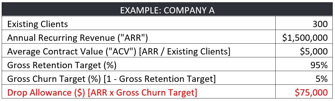
Hopefully, this is all straightforward, so let’s dig into an example of a business with the following profile:
We’ve found that this small act of translating percentage-based objectives into a $-based goal to be helpful to the whole team, and particularly to renewal professionals (such as Client Success Reps, Account Managers, and Salespeople). But that’s just a start. Next, layer in ACV, as follows:
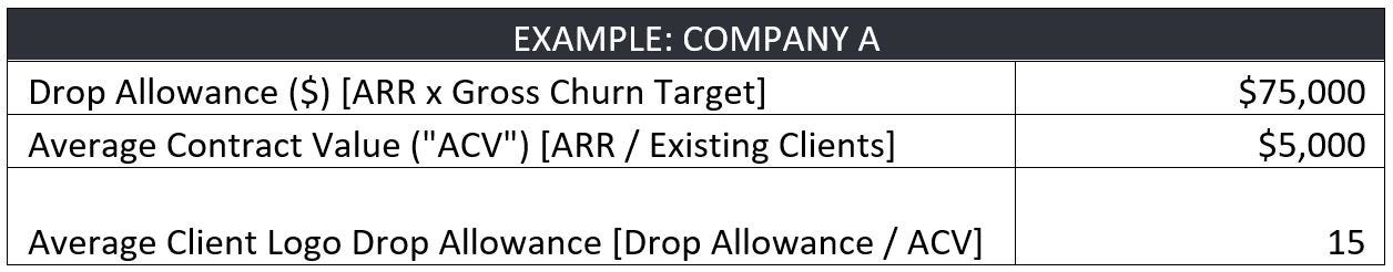
This simple math makes it clear that if we head into the year with 300 paying clients, achieving our retention goal relies on having no more than 15 average-sized cancel their subscriptions across the course of the year. Gulp — this just got real.
Of course, we have large clients and small clients; and this approach also helps quantify the clear-and-present danger of large drops to our company’s health. Although I tend to err on the side of believing every client is worth working to retain, this also raises awareness among the team around where to direct their finite retention-focused resources.
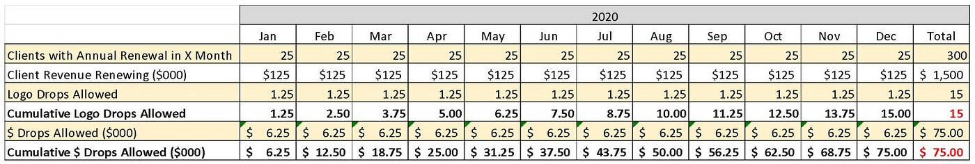
By quantifying the total number of budgeted dropped logos, this also offers an approximation of the acceptable rate of drops across the year. If this business has ZERO seasonality (and hence, no renewal concentration in any given quarter or month), it can theoretically afford to average 1.25 logo drops per month [15 Average Logo Drops Allowed / 12 months]. But we can be even more precise than that, and this is where the real value of metrics related to drop allowance emerges. For the sake of argument, let’s proceed with that simplifying assumption that there is zero seasonality in the business; and that all 300 of the existing clients had been sold evenly across all historical months. We could plot out the renewal pool ($1.5M across 300 clients), drop allowance ($75,000 across 15 logos), and a related monthly budget for each, as follows:

Then we can make it more useful and dynamic by showing these numbers as cumulative across the year, as follows (with shading to help readability). It would look like this:
So far, so good, right? Now…let’s move out of the realm of plans and averages, and into the messiness of the real world.
Let’s assume for a minute that we’re through five months of 2020, and we’ve been actively managing and monitoring our renewals, and they look like this:

Viewed through this lens, it’s clear that retention has significantly worsened after having started the year well. But without a baseline, it’s hard to deduce much beyond that general assessment; and it’s even harder to quantify when we factor in complexities such as down-sells, seasonality of renewals, and widely variable client-sizes. Instead, leveraging drop allowance can offer a granular budget-versus-actual look every month (or even more real-time) and on a cumulative basis, as follows:
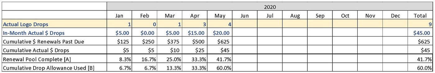
This is where the real pay-off comes. Armed with the above information, we can boil all of this renewal complexity down to one single metric that will tell us how we are performing on renewals, not just against the (maddeningly distant and monolithic) year-end goal, but rather on a rolling basis and relative to the seasonality of our renewal pool. This can be done by establishing a ratio of the RENEWAL POOL COMPLETE (“RPC”) [A] / CUMULATIVE DROP ALLOWANCE USED (“CDAU”) [B]. Using the numbers from above, it looks like this:
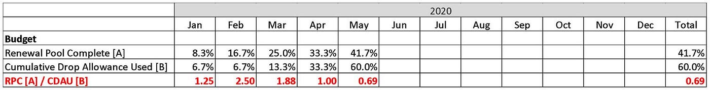
Admittedly, that is an awful lot of words, so we like to simply call this the YEAR-TO-DATE RETENTION RATIO. Whatever it’s called, this KPI offers easy-to-understand clarity around gross retention. By looking at this one number, we can know where we stand, relative to what renewals have already come due and which are still outstanding throughout the year. Quite simply, a YTD retention ratio >1.0 means that we are outperforming relative to possible renewals year-to-date; and a ratio below 1.0 should be cause for concern (i.e. we’ve already used up more of the drop allowance than budgeted, relative to renewals past due). Because I’m a visual learner, I like to see all of the above numbers as charts; below is a simple one for the YTD RETENTION RATIO from this example.
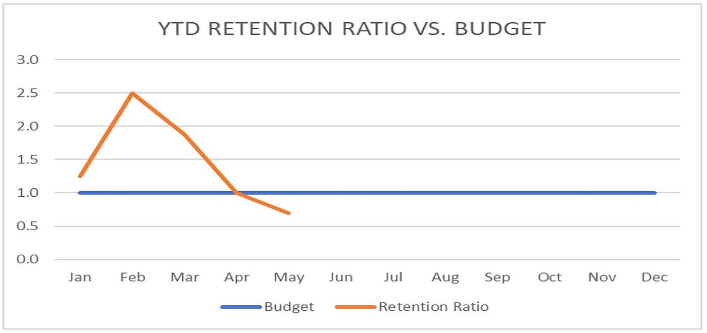
This chart helps highlight how YTD retention ratio can serve as an early warning system, signaling the need for intervention. More so than most metrics, it spotlights changes in churn patterns with speed and sensitivity, which can tip-off operators to dig into any number of related variables and levers. Taken together, these can that help inform a number of operating decisions, including: timely personnel changes (e.g. does this problem warrant hiring an AM dedicated to renewals?), systems investments (should be invest in client engagement solution?), and process improvements (e.g. how can we enhance our on-boarding?). I’ll plan to dig into this aspect of things in a future post.
Closing: I know that was a lot of math above, so let’s conclude with a few closing comments.


